Adding Top Bar to Websites
,
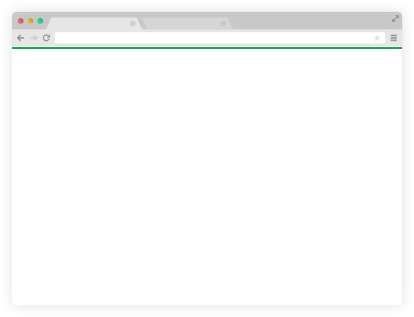
Top bars are beautiful looking lines at the top of a website. A colored top bar would not do any harm. Instead, it increases the beauty of your website (if used correctly). Read to know how I have implemented it in my websites.
Why top bar?
I started considering top bar only after I saw the designers from Quora started using it. I also used to have a top bar on this blog but after the new design I no longer use it. But, one of my blogs Nallikayi has a nice top bar which goes with the design.
I remember YouTube using a red top bar to show how the progress of page loading. That was only for a while and for some reason they stopped it. But it seems like they are still using it! You can see it when you click on a video link. Actually it is a great idea to show the users how much page has been loaded without any distractions. By the time I’m writing this blog Freecharge is using the top bar as a progress indicator. It must be a div on top with a 1 pixel border but looks like body top border.

If you have seen Chrome browser on android, they still use this. May be it is using a different code but visually similar to that we use in websites.
So here it is giving some valuable information. But what I want is just a minimal colored top bar to enhance the visual appearance. It is very easy and can be done with a single line of code!
what is the code for top bar!
Just copy these lines to your css file and you’ll have a top bar! So far we have called this top bar but in reality it is the top border of your body. Normally it is invisible, we are just giving it a size, style and color. Pretty neat. Isn’t it? There is not a single extra div used. So there is no extra load on your website!
body {
  border-top: 4px solid #37ba8a;
  margin: 0;
}
So that’s all there is! Use em instead of px if you like. I use em as I have configured it to adjust to the screen-size. Now change the color according to your theme and don’t make it very contrasting, say a blue top bar on red background. That is not very pleasing to eyes. And also make sure the body has no margin. Otherwise you may not get the top bar where you wanted.
Though it is a simple thing, it gives a huge impact on the look and aesthetics. Check the difference between these two sample websites I made for my mom.
No top bar: No top bar
Top bar: Top bar
Extensible!

This can be used on buttons to make them look awesome! This can give a modern look to almost all the elements. One such thing I have noticed is in gmail categories.
Here is a button with just borders
Here is the HTML code..
<button class="border-style">WebJeda</button>.. and CSS
button.border-style {
    font-size: 18px;
    color: #41A720;
    margin: 0;
    padding: 10px 25px 10px 25px;
    background-color: transparent;
    border: 1px solid #41A720;
    border-radius: 2px;
}
Try mplementing top bar on your website and let me know how it went.
And don’t forget to leave the link in the comment section, of your website with newly created top bar.
Thanks for reading!